
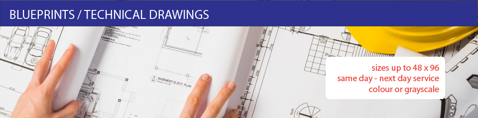
Fast Completion

Jobs completed on time and on budget.
Amazing Quality

Hi-resolution printing for crisp images in beautiful colour.
Digital & Offset Printing
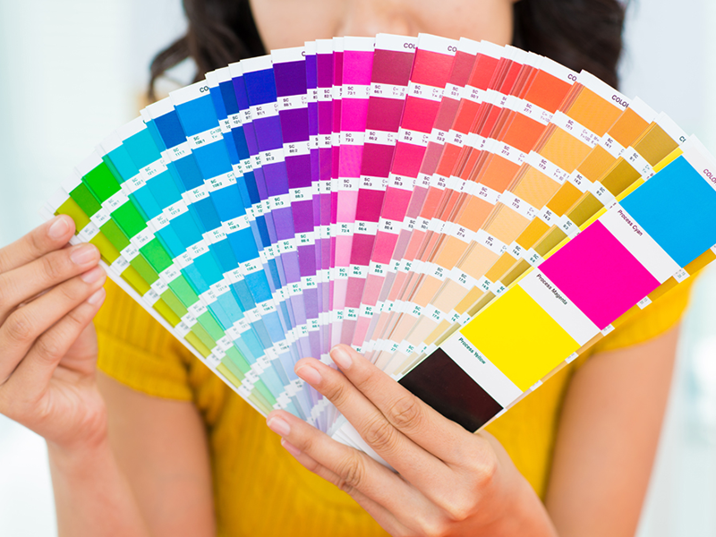
The same high quality whether you print 100 or 1,000.
3 Tips to a Better Business Card
Posted on | January 27, 2026 | Comments Off on 3 Tips to a Better Business Card
A business card is a marketing essential and needs to be properly designed for the bets results. It’s more than simply providing an address and contact number. A well-designed business card can motivate potential customers to make a call, visit a web site and best of all, make a purchase.

1 Use the Back of the Card
People forget that there are 2 sides to the card and often leave the back blank while cramming everything onto one side. It is advisable to keep the name and contact information on the face and use the back for marketing such as a list of services, slogan, photo or graphic.
2 Use Colour
Colour draws attention and makes your card more memorable but use a light hand. Too much of a good thing can ruin the effect. Strategic use of a colour in a logo or graphic can make it pop. Background colours are a great way to contrast front and back but may require the use of reverse (white) type to maintain readability.
3 Make it Readable
In an effort to get as much as possible on the card, designers commonly make the type size of the address and contact number(s) too small. Test readability by looking at your card in a dimly lit room or at arm’s length. The smaller the type the darker it should be or the higher the contrast between type and background.
If you need help with the design of your business card, contact our design department.
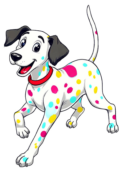
Qwik Print Introduces “Spot” Mascot
Posted on | January 23, 2026 | Comments Off on Qwik Print Introduces “Spot” Mascot
Our official mascot is “Spot” the Dalmatian dog. Unlike the real thing which has only black spots, Spot has multiple colours representing the CMYK (cyan-magenta-yellow-black) colour used in printing. You will soon see Spot appearing in marketing materials and correspondence. Our illustration, designed in-house, is based on a papier-machete sculpture that resides in our lobby.
A mascot character can be a surprisingly powerful business asset—especially for small and local brands that want to stand out without a massive ad budget. Here’s why mascots work so well.
1. Instant Brand Recognition
People remember characters better than logos or taglines alone. A mascot gives your business a face—something customers can spot instantly on signs, packaging, invoices, social posts, or delivery vehicles.
2. Emotional Connection
Mascots humanize your business. They feel friendly, approachable, and relatable, which builds trust—especially important for service-based or local businesses where relationships matter.
3. Consistent Brand Personality
A mascot locks in your tone:
- Fun and playful
- Skilled and professional
- Quirky and creative
Once defined, it keeps your messaging consistent across marketing channels.
4. Strong Marketing Flexibility
Mascots are endlessly reusable:
- Seasonal outfits (holidays, sales, events)
- Explainer graphics (“Here’s how it works”)
- Social media posts and ads
- In-store signage and promos
They scale far better than one-off graphics.
5. Better Engagement & Shareability
People are more likely to engage with, comment on, or share content that features a character—especially when it has humor or charm. Mascots perform particularly well on social media and in email marketing.
6. Differentiation from Competitors
In crowded markets, a mascot helps you look distinct, not generic. Two businesses can sell the same product—but only one has that character customers remember.
7. Long-Term Brand Equity
A good mascot grows with your business. Over time, it becomes a recognizable asset that reinforces loyalty and repeat business—often outlasting campaigns, slogans, or redesigns.
Bottom line:
A mascot isn’t just decoration—it’s a storytelling tool, a relationship builder, and a reusable marketing engine rolled into one.
The Power of the Printed Menu
Posted on | January 21, 2026 | Comments Off on The Power of the Printed Menu
In a world dominated by screens and QR codes, the printed menu remains a powerful and effective tool for restaurants, cafés, and hospitality businesses. A physical menu creates an immediate sense of professionalism and trust—guests instinctively associate printed materials with quality, care, and attention to detail. It signals that your brand is established, intentional, and customer-focused.

Printed menus also enhance the dining experience by being simple, accessible, and intuitive. There’s no need for phones, apps, Wi-Fi, or downloads—just pick it up and browse. This removes friction, reduces distractions, and keeps customers engaged with your food, not their screens. It also ensures accessibility for all guests, including seniors, children, and anyone who prefers a traditional experience.
From a branding perspective, printed menus are a powerful storytelling tool. Paper choice, layout, typography, color, and finishing all contribute to your visual identity and atmosphere. A well-designed menu doesn’t just list items—it reinforces your brand personality and influences purchasing decisions.
Most importantly, printed menus sell. Strategic design, layout flow, and visual hierarchy naturally guide customer choices, increasing average order value and promoting high-margin items. In short, a printed menu isn’t old-fashioned—it’s a proven, high-impact sales and branding tool. Something the large chain restaurants understand and a strategy smaller, boutique restaurants should adopt.
Printed menus are not expensive and when measured by return on investment are one of your simplest means of increasing sales.
Embedded Marketing
Posted on | January 11, 2026 | Comments Off on Embedded Marketing
Looking for a low-cost way to increase sales, announce new products and improve customer loyalty? Embedded marketing may be for you.
Embedded advertising is the inclusion of sales-related information with bills, statements and notices in the form of inserts and printing directly on statements. Businesses, realize they can take advantage of regular communications to reduce advertising costs, sell more products and develop customer loyalty. Sophisticated users tailor messages to specific customer groups and individuals using demographic and previous sales data.
Although many businesses are migrating billing notices and potentially all of their communications with customers to electronic forms, they may be ignoring the value that customers place on a tangible printed statement. It’s especially important to businesses in highly competitive markets where regular customer contact is beneficial.
Bill notices have near-100% open rates. Customers may ignore ads, emails, or social posts—but they always open invoices. Embedded marketing leverages this guaranteed attention without feeling intrusive. Does it work? Look at the notices you receive from companies such as Home Depot, Canadian Tire, utilities companies and others. Most include some promotional information with their monthly mailings.
Interactive Printing – How to Use QR Codes in Print
Posted on | November 22, 2025 | Comments Off on Interactive Printing – How to Use QR Codes in Print
QR Codes are those weird-looking blocks of white and black that looks like an unfinished crossword puzzle or terrazzo floor. In fact, those squares contain a lot of data that can be read with a simple app on any smartphone. Typically, the information is a web site link but can include name and address information, a sales message or instructions.
An example, linking to our home page www.qwikprint.ca is shown at right.
How to Read It
To read a QR Code you need a mobile with a built-in camera and the necessary QR code reader software installed. To read the QR code, hold your phone over the code and click on the reader app. This will launch the web browser on your phone and immediately direct you to a webpage assigned to the QR code. This linking from a physical real-world object is known as a “hard link”.
How to Get a Reader App
QR-code readers are available for a wide variety of smart phones and several websites allow you to generate your own QR codes free of charge. Here is one of our favourites:
How can QR Code technology help your business?
Here are some examples.
If you are a tourism business, add it to your print materials and ads. Visitors need to find you and don’t have a computer handy. Instead of searching, they can simply hold their phone over your ad and be immediately directed to a map or other page on your site.
If you are a retailer, you may want to include a QR code in your newspaper ad for direct mail marketing piece which would drive readers back to your website where they could get additional information on the products on sale and special offers only available through your website.
There are lots more ways to do it and we can easily add a QR-code to any printed items, including a business card. Tell us what you it to contain and we’ll create it for you.
7 Deadly Mistakes of Restaurant Menu Design
Posted on | October 1, 2025 | Comments Off on 7 Deadly Mistakes of Restaurant Menu Design
The following is a list of some of the most common mistakes associated with the initial design and updating of your restaurant menu. They are easily avoidable and many are common sense. Call for help on the design and printing of your next menu.
- Hand-written changes on the menu. Digital printing allows for quick and inexpensive menu updates so it is better to reprint when making pricing changes or discontinuing items. Not only is it time consuming making manual changes, it always looks “last minute” and adversely affects the look.
- Misspelled items and text. These errors can be eliminated with careful attention and editing by more than one person. If you design your own menu it is very easy to miss common errors that spell checkers do not detect.
Read more
How to Use Bleeds in Your Print Work
Posted on | January 16, 2025 | Comments Off on How to Use Bleeds in Your Print Work
Like the look of advertising or book illustrations where the image runs off the edge of the page? That’s called a bleed and it’s an effective design technique. It’s also essential whenever you want a background colour over the entre surface without the tell-tale white border around the page.
Defining a bleed is necessary because presses, copiers and most other printers do not print to the actual edge of the sheet. This means there is always a “white”, unprinted area at the edge of the page.
To overcome this, the printed sheet is actual larger than the final size of the document. The excess area is trimmed after printing to allow the image to continue to the edge of the page. Because trimming is not perfect, it is necessary to increase the printed area slightly so the cutter is actually trimming off a small amount on the bleed edge. This is called the “bleed area” and for most small-format print jobs, the bleed area is kept to about .125” to .25”.
Example
Suppose the final size of your print job is a standard letter-size page of 8.5” x 11”. To allow for .125” bleed, the actual page size before trimming would be 8.75” x 11.25”. If you want photos or graphics to bleed off the page, they should be positioned so that the outer edge would run into the bleed area. When the page is trimmed, the outer .125” gets trimmed off and looks nice and neat – no white area.
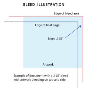
Suggestions
When setting up your page, whether in Word, Publisher or other design program, you need to modify the underlying page size in the Document Setup area. Even if you plan to have the bleed only occur on one edge of the final document, the bleed is applied to all edges of the final document.
When you setup a job with bleeds there is typically an increase in cost because a larger sheet must be used and the final job needs to be trimmed down to the final size.
When creating a PDF document from your original, pay close attention to the Page Size settings in Acrobat. It typically generates a document at standard sizes so your artwork will be reduced to fit thereby removing the bleed area.
Black is Back
Posted on | January 16, 2025 | Comments Off on Black is Back
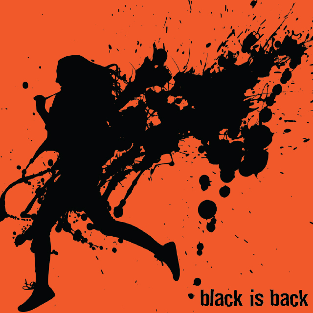 Black printing has largely been replaced by full-colour when it comes to advertising work but it still remains suitable for flyers, newsletters and forms. It gains new life when printed on toned paper – anything from subtle buff and off-white to brilliant neon colours. We offer a variety of these papers in house and offer hundreds by special order.
Black is more than just black. It is also a range of gray tones that create a variety of effects in type and render graphics in photographic quality. But to get the proper affect it is important to design your artwork properly.
Here are some suggestions for designing effective black-only artwork:
• If possible design the original in gray-scale so you can accurately assess the light and dark values.
• If you can’t design in gray, convert the document to gray-scale using Adobe Acrobat’s prepress settings.
• Keep in mind tonal range and ignore colours. If you place a red shape on top of a green shape with the same lightness, the two will blend together when converted to gray-scale.
• Keep in mind the colour of the paper you are printing on. Faint gray tones virtually disappear on rich colours.
• Consider the paper colour when choosing lightweight or thin fonts. These can disappear on dark papers.
Flyers are typically printed on 24LB paper, whether white or colour paper and can be folded like a brochure or accordion style.
Qwik Print Acquires Keeing Printers
Posted on | September 19, 2020 | Comments Off on Qwik Print Acquires Keeing Printers
Effective September 1, 2020, W.D. Keeling Printers Ltd. was acquired by Qwik Print, located at 1240 Ave East. All print work from this date forward will be completed by Qwik Print. Original artwork and job dockets are on file so we can reference all previous jobs for the last several years. Additionally, two previous employees of Keeling’s have been hired by Qwik Print.
In the past two years, Qwik Print has made significant investments in the latest digital print technology resulting in reduced production times and the introduction of many new products. Prior to the merger, Qwik Print expanded it’s production area and added a KIP 860 36″ wide laser printer for production of architectural drawings, business graphics and posters on a variety paper and vinyl material.
Menus – Sola’s Grill
Posted on | April 13, 2020 | Comments Off on Menus – Sola’s Grill
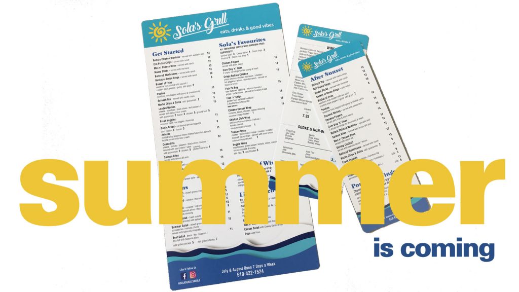
Popular Sola’s Grill of Sauble Beach is getting prepared for the summer season with an update to their extensive menu, this year printed on synthetic paper. Synthetic paper is really a plastic material that is waterproof, tear proof and highly durable. This type of menu does not require lamination and has a matte finish. The material takes ink very well so colours are vivid and type is crisp.
We produced three menus, a large format 8.5 x 16” roadhouse with almost 80 items, and two smaller menus for late-night and drinks. All have rounded corners for improved wear.
Check out all of our menu options.
keep looking »


You must be logged in to post a comment.